
Interaction mapping
Illustrated multiple user pathways when navigating the website
American Library Association
UX researcher
4 months ( Jan2019 - Apr2019 )
4
User research
Qualtrics, Interviews, User flows, Personas, Comparative analysis, Heuristic evaluation, A/B testing, Usability testing
The Office of Intellectual Freedom of the American Library Association redesigned the Banned Books website in 2017. They wanted to ensure the redesign met users' needs by having a website that offered easy website navigation and access to frequently requested materials. Our team conducted a needs assessment and a seven-step usability evaluation of the website to understand where users experienced difficulty and provided recommendations to address those issues.
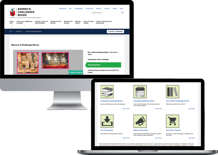
The Banned Books website is a resource for individuals to learn about banned or challenged books and the censorship of literature. The Office of Intellectual Freedom (OIF), a department within the American Library Association, implements policies on intellectual freedom and free access to libraries and library materials and manages the website.
The Banned Books website is easily confused with Banned Books Week, a sibling website dedicated to the week-long annual and nationally hosted event organized by the OIF.
The OIF redesigned the Banned Books website in 2017 and wants to ensure the redesign meets users' needs by providing easy website navigation and access to frequently requested materials.
Illustrated multiple user pathways when navigating the website

We interviewed the appropriate user groups to discuss their general attitudes on book censorship and their opinions of the current website

We analyzed competitor websites to identify the strengths and weaknesses of the current website configuration

Distributed a 30-question survey to target a larger group of users, gathering additional data about general attitudes, knowledge, and opinions about the Banned Books website

Each team member performed an evaluation of the Banned Books website to identify significant usability issues from different perspectives

Created a preference test for users to compare the current Banned Books landing page with a reformatted version

We performed a moderated usability test with users to understand their experience navigating the Banned Books website
If I could go back and improve an aspect of the project, it would be the User Preference test. In hindsight, we could have done a more comprehensive test, incorporating additional pages rather than focusing solely on the landing page. We missed out on some rich information by limiting ourselves to one page.